Catalogue In Focus: CTRL+P
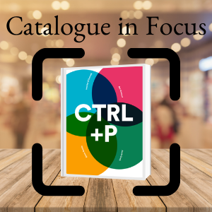
You may remember that the beginning of Covid lockdown saw a fair few joint catalogues appear in the rare book world. Good friends and colleagues - Ben Kinmont, Justin Croft, Heather O'Donnell and Simon Beattie - issued one of the first collegial catalogues aptly titled At Home with Books. They enjoyed the project so much that, encouraged by the results and feedback, they decided to embark on a second joint enterprise. This time devoted to the many varieties of print and printmaking, CTRL+P, each contributed 5 books and designer Dean Pavitt worked on the design again. Prices start from $20 for a street printing to a typography scrapbook for $5,000.
Justin Croft says about the joint venture: "The decision to work together on these catalogues has been instinctive: we all admire each other’s materials and approach to bookselling. When you have that kind of connection, compiling the catalogue is actually very simple - you just know that your colleagues will come up with great contributions with an imaginative twist on the theme. In this case Simon suggested the title and within a few days everyone’s contributions were in, beautifully described and illustrated (I think!)."
Heather O'Donnell sums it up when she says that these catalogues "... have been a great way for the four of us to learn from one another and share what we do with a wider audience. We almost never have the same books, but we now have some of the same customers, thanks to these collaborations."
Ben Kinmont particularly liked the fact that the themes give him a chance to look at his inventory in a different way and therefore opening it up to collectors he would probably not reach with his specialist catalogues. Simon Beattie agrees: "I enjoyed looking through my stock with new eyes. Often one buys a book for one reason, but that isn’t necessarily its only saleable feature. I remember years ago listing a little publication about the 1936 Berlin Olympics in a catalogue. I got three orders: one from someone who collects photobooks, one from someone with an interest in Germany in the interwar period, and one from someone who collects the Olympics. As a bookseller, you’re always learning about what your customers are looking for."
I love that you are celebrating the unsung heroes, the printers. When you prepared the catalogue, did you have a eureka moment, when you discovered a new angle about printing?
Heather: Not so much a new angle about printing itself, but it was definitely interesting to cast a fresh eye over my books, not from the perspective of period or genre, but from the perspective of printing.
Ben: In a time when everything is electronic, the focus on printing really makes you appreciate the person behind the printed material, you really start to think 'someone made this'. The catalogue also made me reflect on how much has changed in the 20th century on the printing front; from street printing to printing on demand, publishing has become more accessible to more people.
Justin, your catalogue contribution includes a significant book that shines a light on the world of women printers / stationers/ booksellers in the city of London in the 17th Century? How did you come across it and how did you find out about the women involved?
I always look out for women printers and women owners, as there is so much interest in them currently. In this case, all the stars aligned as this one book had a woman printer, a woman bookseller, and an early woman owner (OK, it was written by a man…) There is lots of great new work on women printers - with biographies emerging from the bare facts of their names appearing on title pages and a serious re-evaluation of the integral role of women in print. I haven’t identified the early owner beyond her name – but it should be possible and it’s a small research challenge that the new owner will doubtless unpick. I’m a firm believer in leaving some of the fun for the buyer. I was fortunate to have bought this from a private owner who felt that it would mean more to someone else, so they were willing to part with it.
The other item also has a city connection, but it's a caricature print, which is both a satire and advert for bookseller Thomas Tegg's caricature prints - can you tell us more about their importance in the 19th Century?
The Tegg print is fantastic, in my opinion. Any depictions of historical book and print shops are of great interest – showing how print was marketed and consumed by the public. In this case it’s treated satirically, but the detail of Tegg’s shop is glorious.
Heather, with The BC's Bond connection it is no surprise that 'Spectre' caught my attention. What a great example of a self-published college literary magazine. Had you known about it before you found this copy and can you tell us a bit more about it & how it was printed?
That issue of Spectre had been here for a while: I bought it entirely for the connection to Shirley Jackson, a writer I admire. Our focus on printing turned my attention to the mimeograph aspect of Spectre, a classic example of that inexpensive DIY printing process, produced by disaffected students on a budget.
It must have been hugely exciting to find the scrapbook of printed letter forms from various countries from the 16th to 18th Century, compiled in the 19th Century. Was it easy to identify where they were from or did you have to do extensive research?
Considerable work had already been put into cataloguing the scrapbook when I bought it; I spent a day confirming those claims, and researching some of the individual letterforms that interested me most. It was an infinitely absorbing artifact: I could have spent months cataloguing it! Its new owner will have that pleasure instead.
Ben, I am always fascinated by menus, especially if they have been printed on unusual paper or another tactile material. What can you tell us about the two menus included in the catalogue? Why are they so special?
The menu on papier porcelaine is extremely rare and there are menu collectors out there who only specialise in menu printed on this paper, which was only used in France and Belgium for about 35 years from the early 1840s. It was always printed on one side and coated and they used these special iridescent inks, but due to the toxicity of the printing process it was quickly abandoned. As they were handed out at banquets, specifically made for that event on that day, they are extremely rare to find in such good condition.
The other menu is very Californian. It is a very unusual early California menu printed on both sides of a piece of redwood for the joint meeting of the San Joaquin Valley Lumbermen’s Club...at the Old Poodle Dog, in San Francisco on September 9, 1915 and comes from the restaurant's menu archives.
One of the most recent printed materials is a San Quentin death row cookbook written in 2015, but printed on demand by you in April. What is its significance long term for a collection?
Mr Jones wrote to me from prison and asked me if I would carry his book. I have sold about 25 of them so far. Community cookbooks fascinate me. Usually they are women's groups or church groups, and this prison community one is obviously really unusual and particularly poignant. It gives an amazing insight into a community we know very little about. Often these community cookbooks are the only documents we have on how groups, often women, organised themselves and are therefore of real historical importance. In the case of Jones' prison cookbook, it falls into a new area I am working on, one I call 'Gastronomy and economic precarity." This is an area that I think should get more attention and I am trying to change collectors' and curators' perception - I don't just want them to look at the recipes, but want them to see cookbooks as documents of our social and economic history.
I also think it is important that books that are created through a 'print on demand' system, which many collectors are probably not really aware of, is a new form of publishing that should be included in collections.
Simon, I can only admire the beautiful album, a fine example of art nouveau book production.. If only 'card-collecting' albums were made like this these days-is this one of the first examples of its kind? Was it unusually well produced even for its time?
That’s a good question. It’s true that whenever I’ve had similar card albums in the past, they have been from later in the 20th century. I think the rise of chromolithography in the 19th century did allow, as Michael Twyman noted in his book on the subject a few years ago, ‘printed colour for all’. It’s interesting to see a manufacturer, in this instance of biscuits, over a century ago identifying both that deep-rooted human desire to collect and the potential commercial benefits of celebrity endorsement!
We are probably all wondering where our governments are going to get all the cash from, so the Weimar Notgeld is a timely reminder how governments dealt with it in the past! What can you tell us about the Bauhaus involvement?
Notgeld had been around for some years by this point, initially as actual currency as all the coins disappeared during the War, then, when they discovered that people liked collecting the different notes, as a means for towns across Germany to promote themselves and to raise some money at the same time by selling them. (Again, that human desire to collect!) Weimar did have other, earlier Notgeld notes, which were pretty ordinary. It is thought that the Bauhaus got involved probably because a) its physical proximity to the Thuringian Ministry of Finance and the state bank and b) Walter Gropius’ being very well connected. The commission was certainly very important for the Bauhaus. It was the first time that a Bauhaus product was disseminated so widely: it was literally in everyone’s pockets.
...and which item in the catalogue was most admired by the colleagues:
Justin: One of the most thought-provoking items in the list was Ben’s contemporary death row cook book, and I've had several enquiries from my own customers about it. It is a sobering and inspiring reflection of the reach of books and prints.
Heather: The breakout star of this catalogue was the print-on-demand San Quentin Death Row Cook Book, written by current death row inmates in California, offered by Ben. We had orders from the trade, from libraries, from private customers, and from at least one of our high school classmates, which testifies to how compelling that book is, "coming from a community about which we normally hear very little."
(But Heather was also fascinated by the Weimar Notgeld that Simon featured: Each of those Bauhaus notes is like a lightning rod, concentrating the political, economic, and aesthetic energy of a single historical moment.)
Ben: Justin had this really strange item..I have never seen anything like it before, item 6. It's a well preserved 'dressed print' of Mary Magdalene - her robes are embellished with three different brocade fabrics. Just beautiful.
Simon: I love Ben’s aquatints (item 1 in the catalogue). The colour really brings them alive. They are a lovely representation of 18th century French cookery.
View CTRL+P Catalogue >